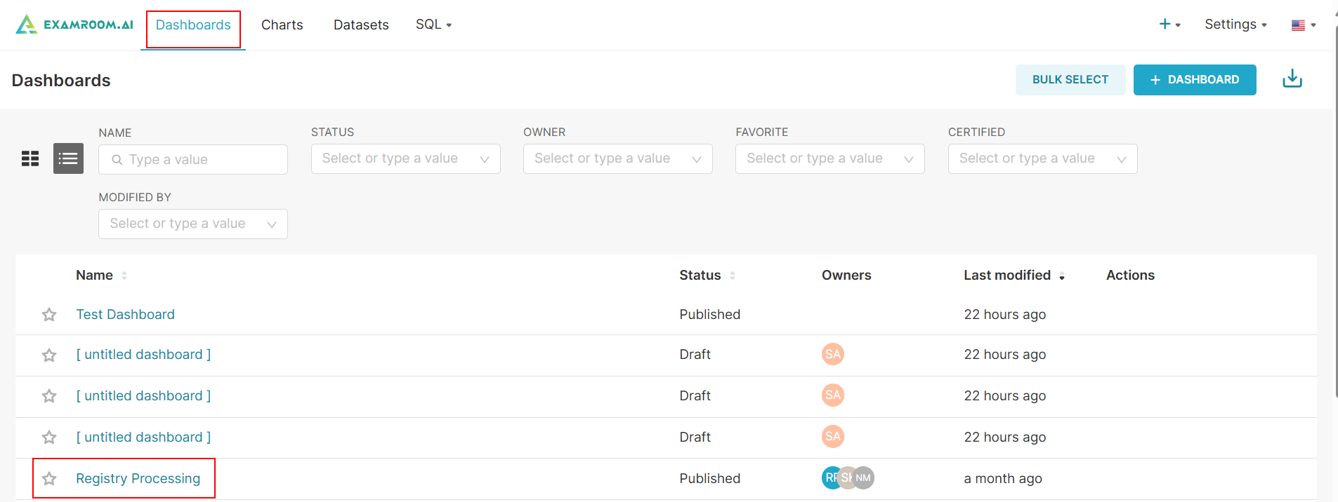
Manage an Existing Dashboard
On the dashboards page, you can view all the charts created for respective dashboards.
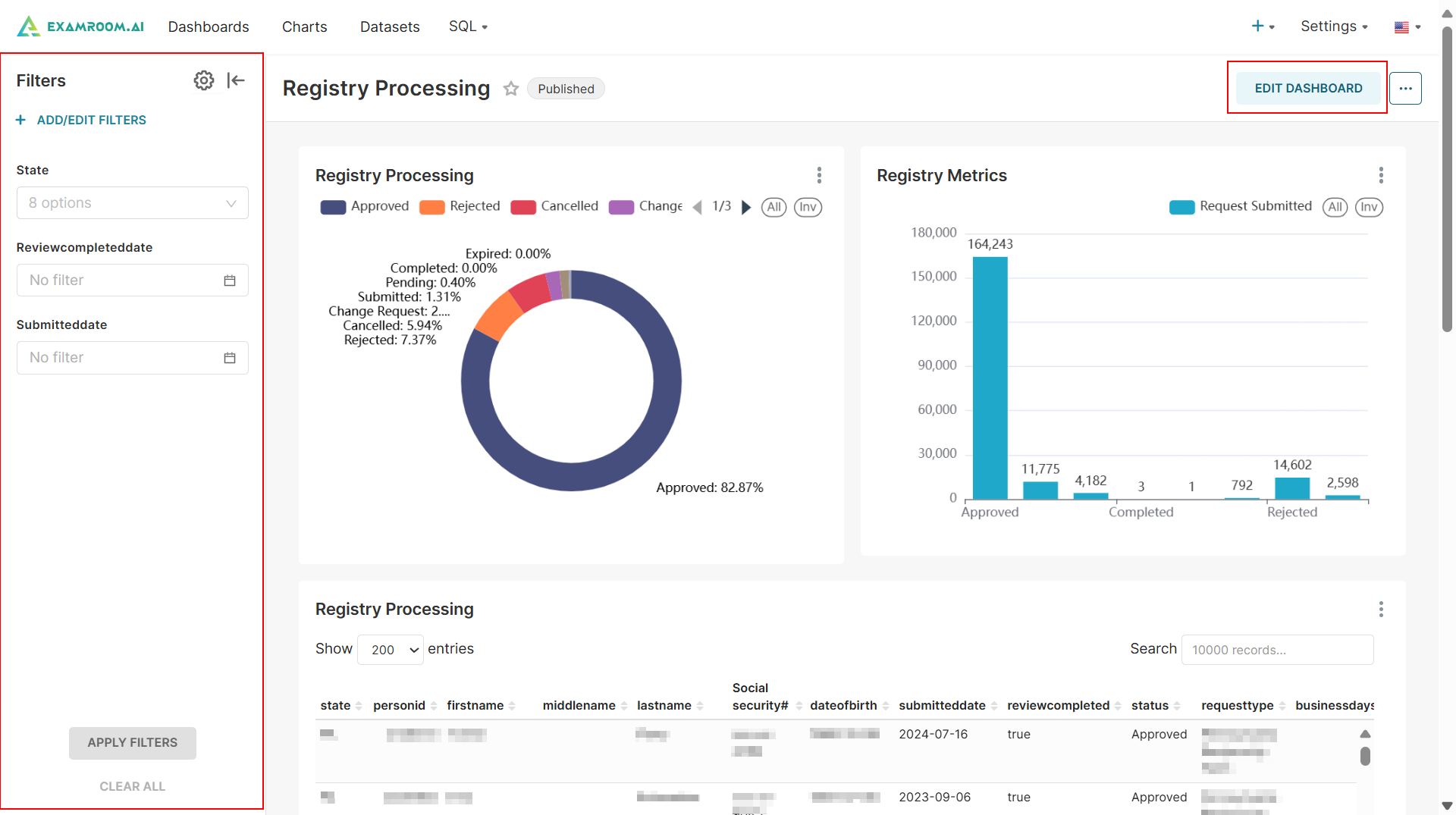
- Click Dashboards from the toolbar and click the Dashboard Name hyperlink to manage the selected dashboard.
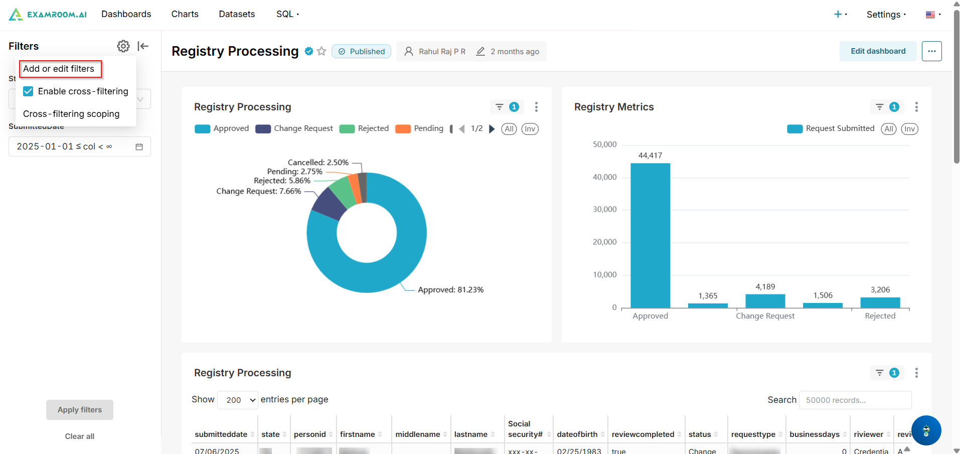
- Click the Filter icon from the side menu to visualize dashboard charts by filtering data based on state or specific time. See Add/Edit Filter to learn how to apply filters.
- Go to Edit Dashboard to learn more about modifying the layout/chart details.
Add/Edit Filter
Filters allow you to visualize dashboard charts by narrowing down data based on specific parameters, which can vary depending on the dashboard or chart selected. Follow these steps to learn how to apply filters.
Note: Filter options may vary depending on the data type, dashboard, and chart being viewed.
- Click the
Settings Icon and select Add/Edit Filters button to add a new filter or modify an existing one.
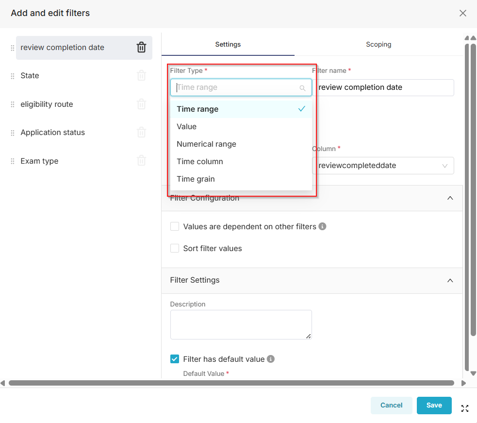
- Select the Filter Type from the dropdown list,
- Time range: Enables start/end date pickers for filtering over periods (e.g., last 30 days).
- Value: For categorical or text-based selections (e.g., dropdown lists).
- Numerical range: For min/max values on numeric data (e.g., scores 70-100).
- Time column: Specifies the exact date/time column for advanced querying.
- Time grain: Sets the aggregation level, like Year, Quarter, Month, Week, Day, or Hour, for grouped time-based visuals.
- Enter a Filter Name, and choose the appropriate Dataset and Column from the respective dropdowns.
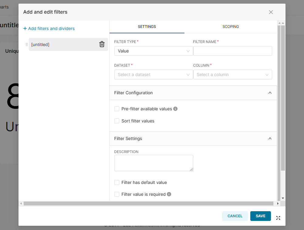
- Under the Filter Configuration section, choose between Pre-filter available values or Single Value to configure the filter settings.
- If applicable, describe in the Filter Settings section for further clarification.
- Click the Save button to apply the selected filters. Otherwise, click Cancel to exit without saving.